Role: 1st Graphic Designer Production designer: Ruth Ammon Director: David Caffrey
Scope of work
Set dressing and prop graphics
Research & reconstruction of period-accurate graphics
Design & production of printed assets (labels, signage, documents)
Cross-department collaboration with SetDec & Props
WORK
I was responsible for the design and execution of set and prop graphics that enhanced the storytelling and visual authenticity of the production — collaborating closely with the Set Decoration and Props departments.
My process involved in-depth historical research, using original references such as 19th-century books, newspapers, and illustrations. These informed the creation of bespoke assets — including signage, paperwork, labels, stickers, and carriage graphics — crafted to integrate seamlessly into the visual world defined by the production designer.
Official trailer — featuring the visual world supported by period-accurate graphics.
ProjectChalenge
Establishing historical accuracy under an intense timeline and visual scope.
Angel of Darkness, the second season of TNT’s The Alienist, takes viewers back to the late 1890s, this time exploring a more dynamic visual side of the city. From elevated railways to bustling markets and luxury storefronts, the season required an intricate and expansive visual world.
In just three months, the team had to establish the visual identity of the city, including Sarah Howard’s office, while fully dressing a massive backlot with New York street facades and a Bowery segment. Filming introduced additional demands, such as scene-specific graphics, from posters and investigative documents to ornate details on Sarah’s safe. The sheer volume of work and tight timeline demanded precise coordination, agile workflows, and tight execution across departments.
With the first season setting a high bar, historical accuracy was paramount. Every detail, from signs to labels, was based on original references from the era. This ensured a deeply immersive and authentic experience, elevating the illusion and captivating the audience.
Bringing the Visionto Life
Creative problem solving and collaboration to deliver immersive design solutions.
Starting with script notes, I collaborated with the production designer to refine the visual vision, gathering period references and experimenting with designs to meet both planned and spontaneous graphic needs.
The graphic work spanned 10 months, during which our team not only designed but also assisted in printing and executing the graphics. As someone involved in the first season’s design, I brought continuity and positive energy to the team, ensuring we upheld and surpassed the high standards set previously.
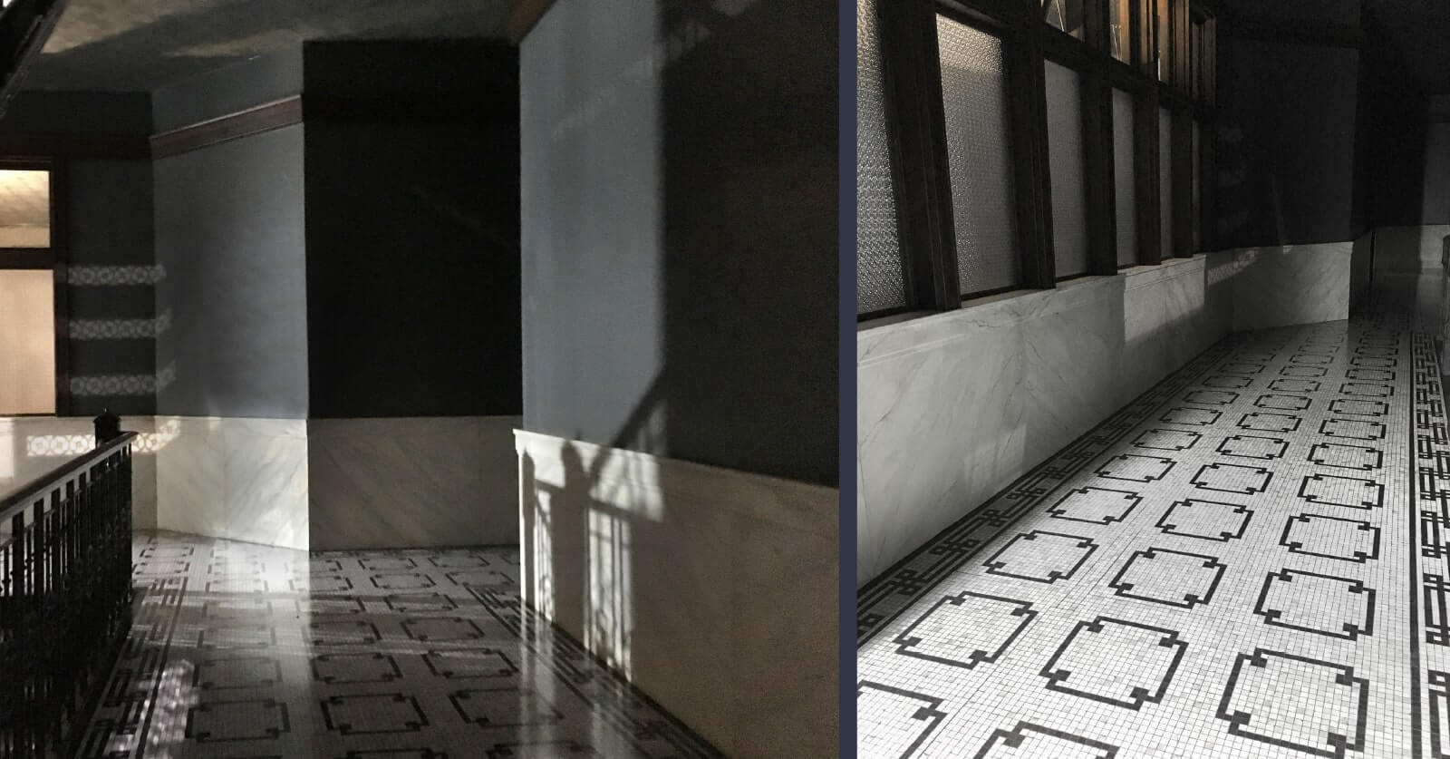
Working closely with architects and scenic artists, I tackled complex projects like ghost signs and unconventional surfaces. A major challenge was Sarah’s office mosaic floor, which required multiple iterations and precise preparation for printing under tight deadlines. In close partnership with the American lead designer, I was responsible for ensuring graphic authenticity, drawing on original references to design accurate period signage and printed materials. Despite challenges, meticulous planning and teamwork ensured all designs were delivered on time and integrated seamlessly into the on-screen world, elevating the storytelling experience.
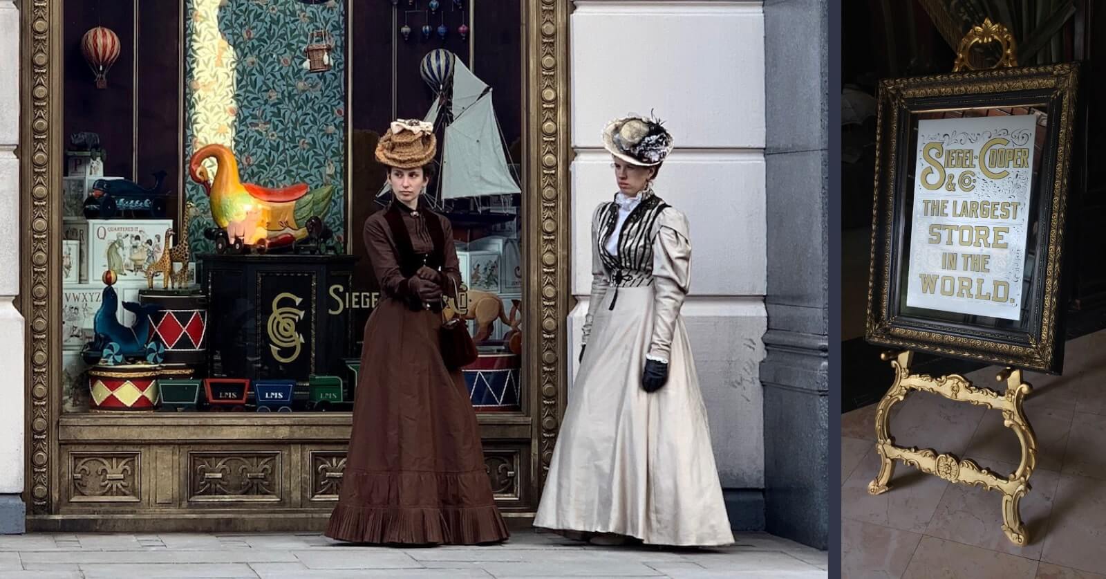
Siegel Cooper Store Window – Period signage and display props bringing an iconic department store to life.
Mosaic Floor Detail – Custom mosaic floor graphic, crafted for Sarah Howard’s office setting.
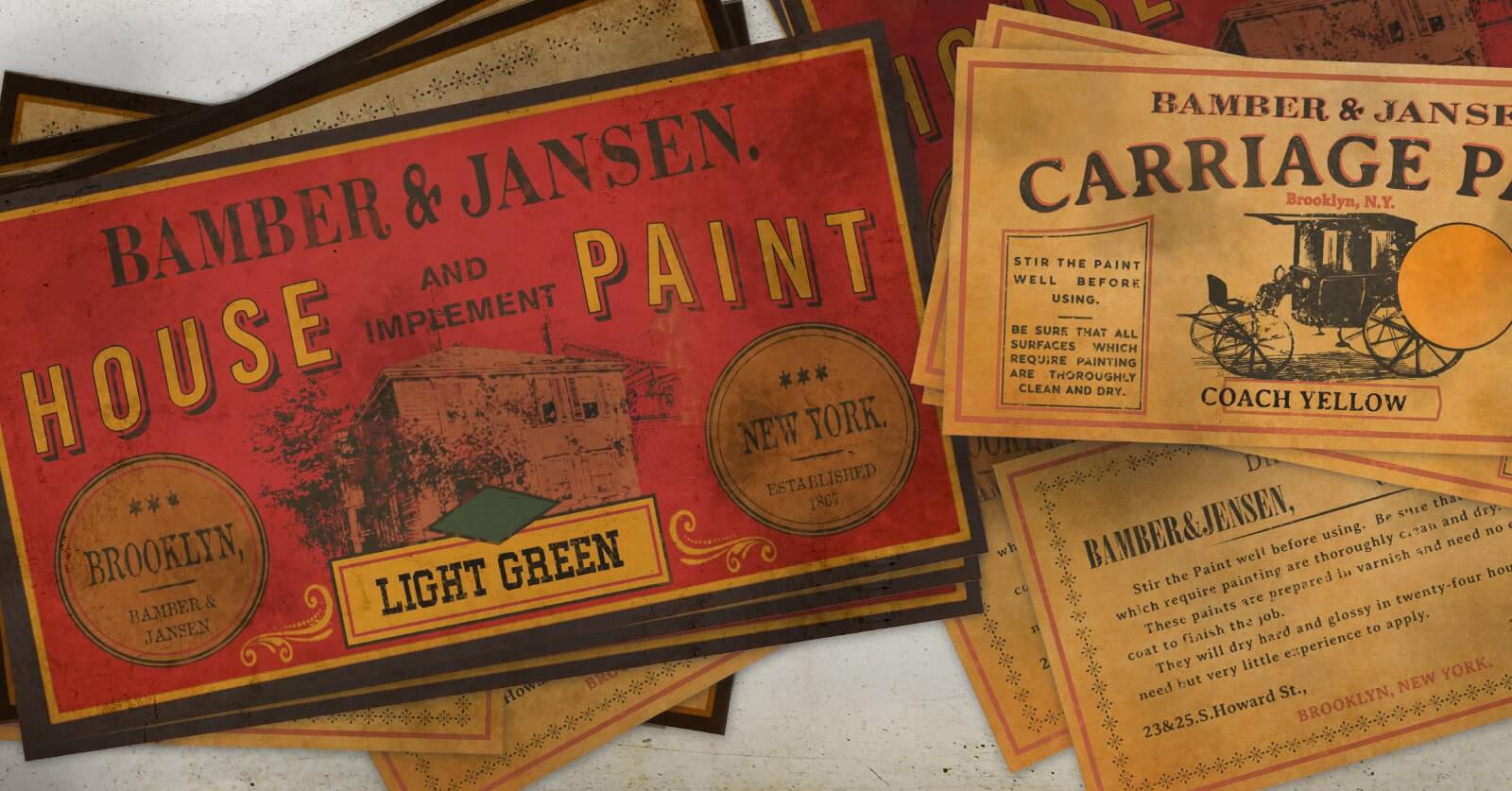
Stacked Period Paint Labels – Overlayed paper props designed with historical printing and type treatments.
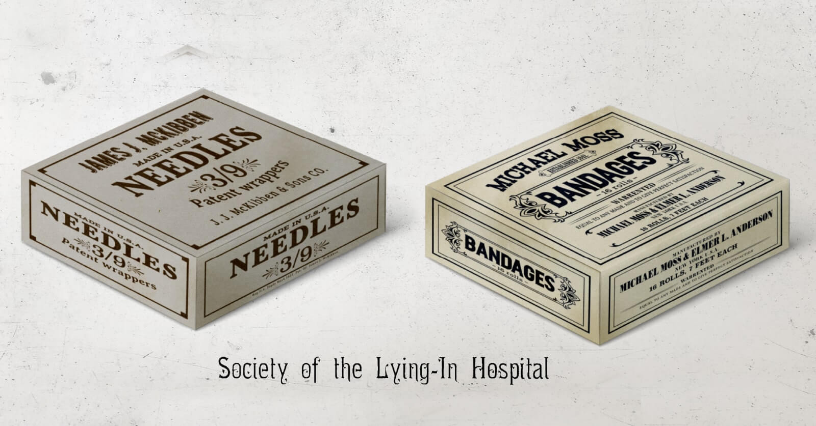
Surgical Supplies Box – Authentic packaging design for 19th-century hospital tools, including needles and dressings.
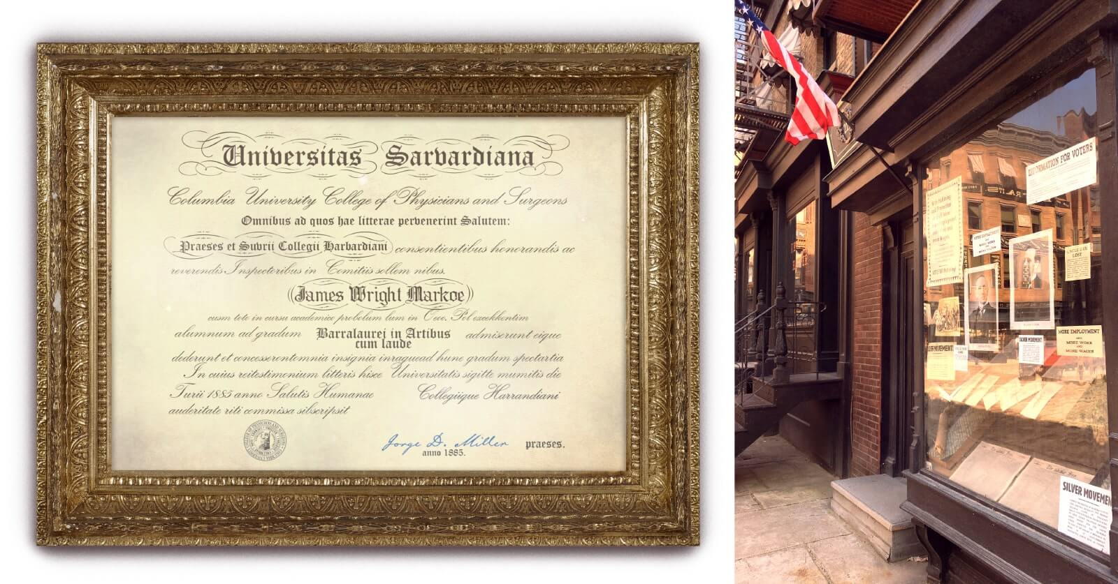
Election Office & Diploma – Period-accurate graphic assets for civic storytelling – from official diplomas to voter registration materials.
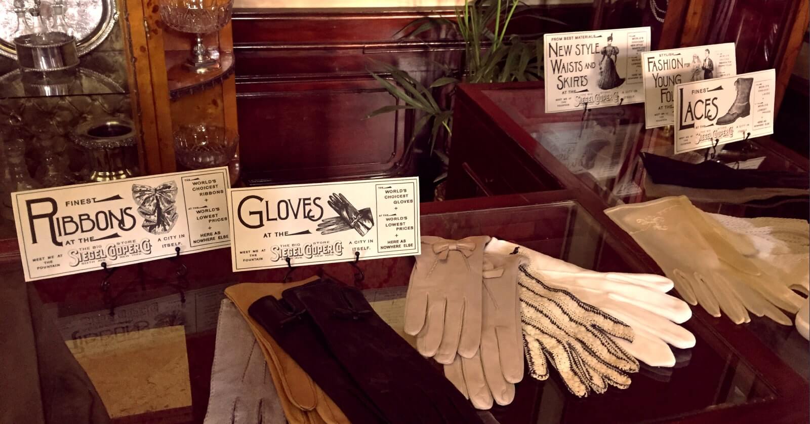
Product Display Graphics – Custom in-store graphics and label designs for vitrines inside the Siegel Cooper department store.
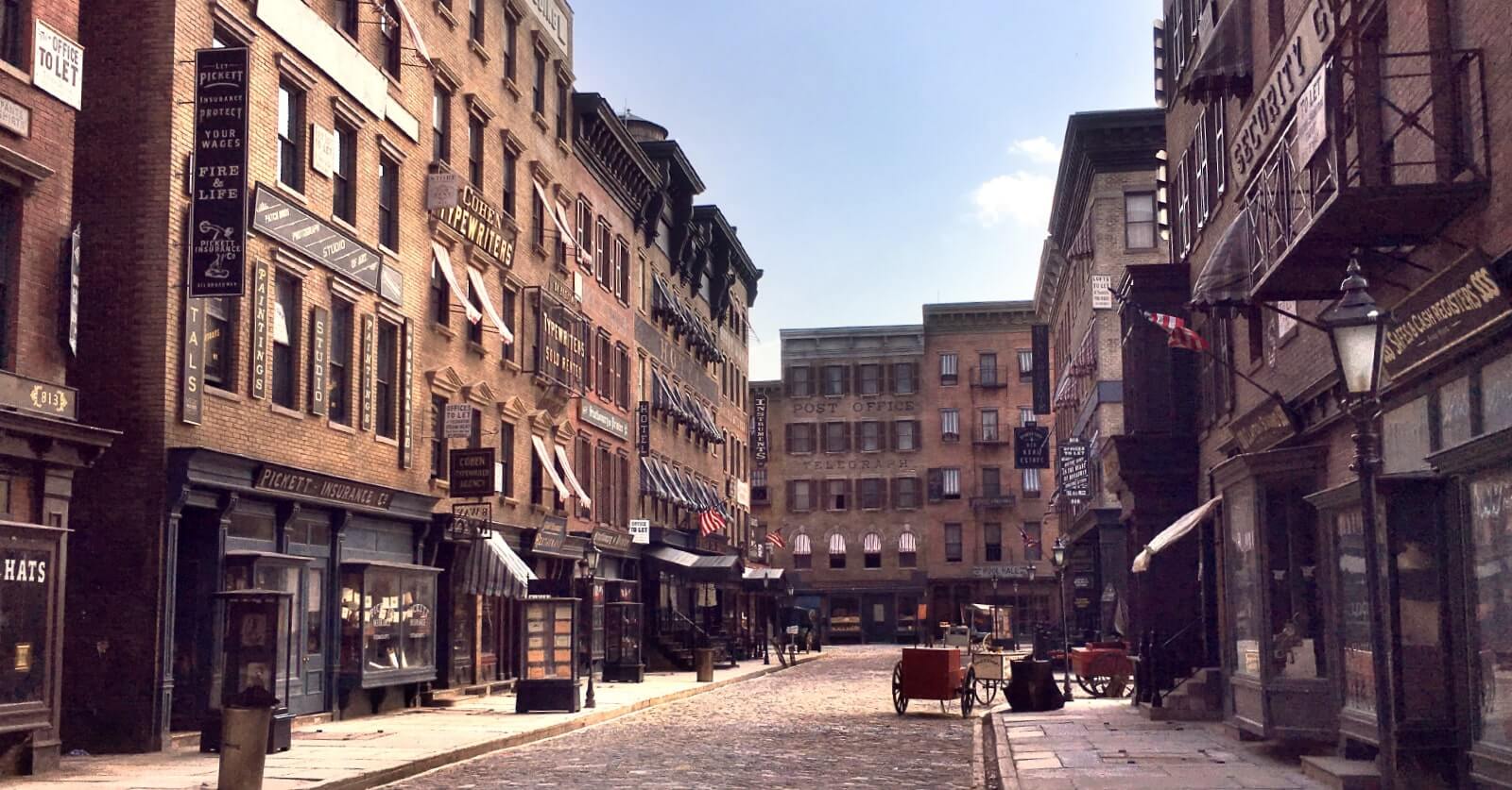
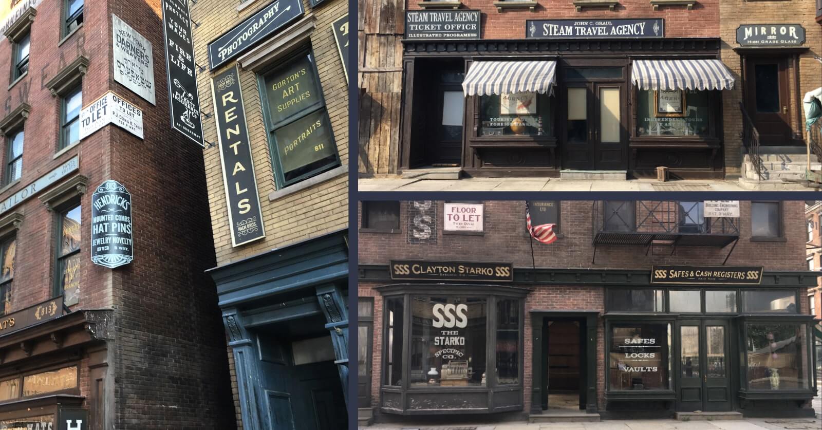
Bowery Street Backlot – Full-scale street dressing with era-accurate signage for shops, offices, and services — building an immersive 1890s city block from the ground up.
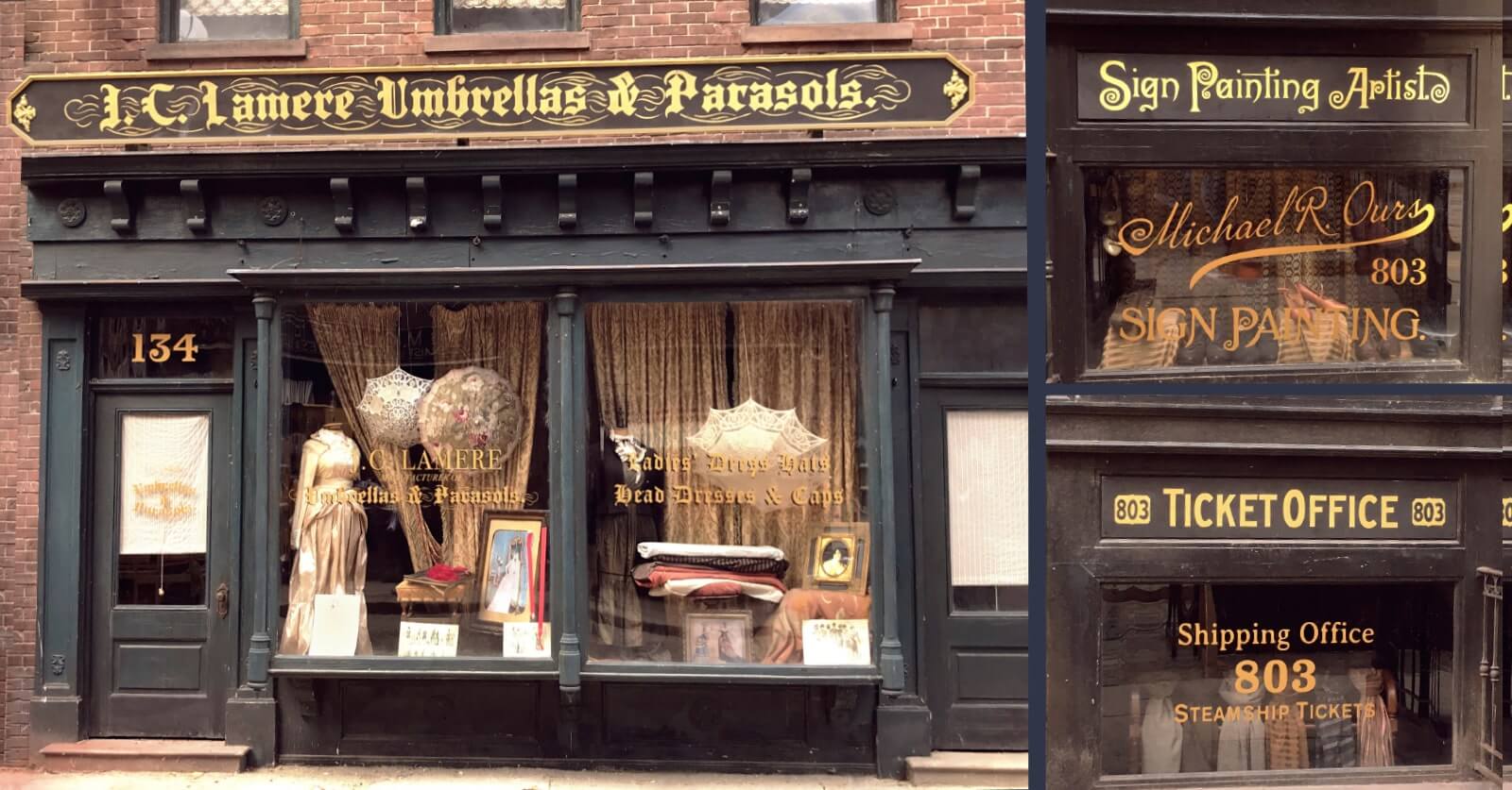
Boutique Shopfronts – Refined storefront and window lettering for upscale retail — evoking elegance through detailed signwork and gold leaf typographics.
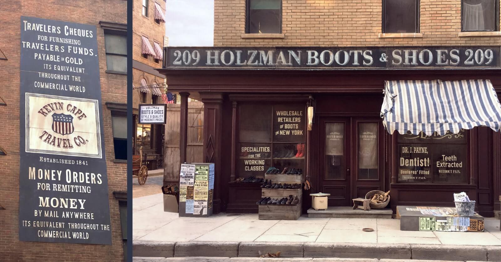
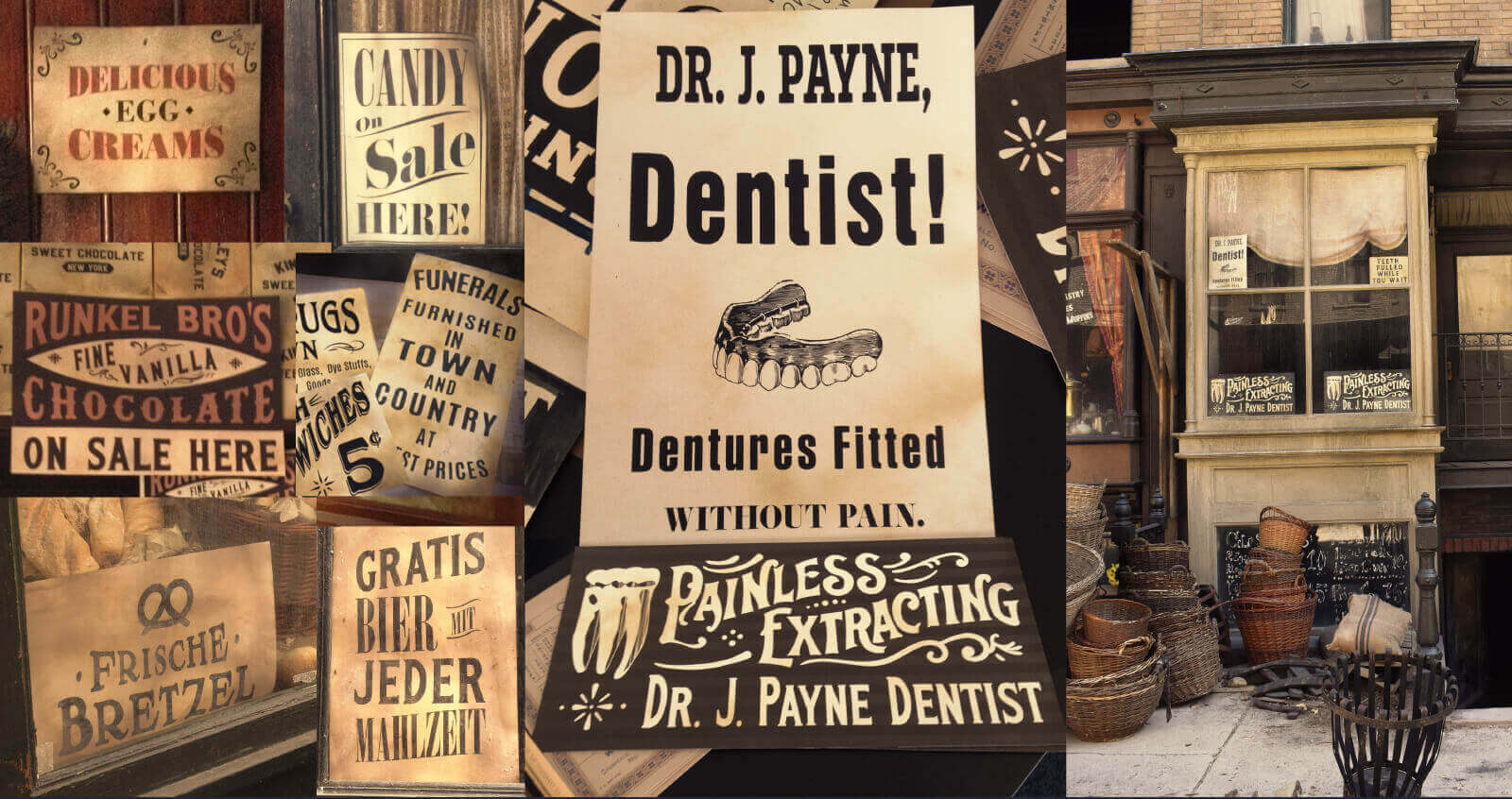
Boots, Dentistry & Bold Ads – Hand-painted signage spanning cobblers, dentists, and towering wall ads — capturing the city’s layered street life.
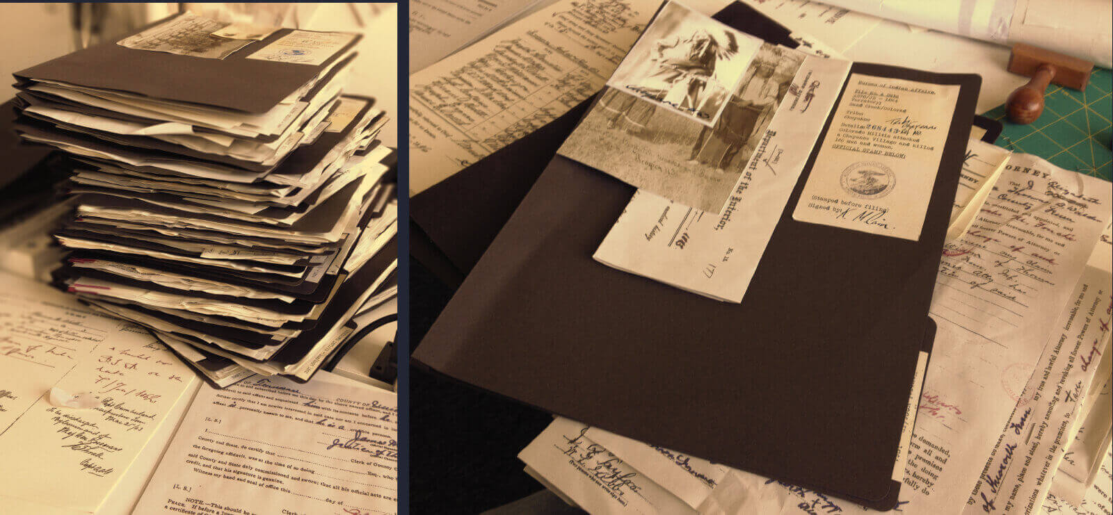
Police Files – Stacks of era-authentic case files — every sheet layered with story, secrecy, and forensic flair.
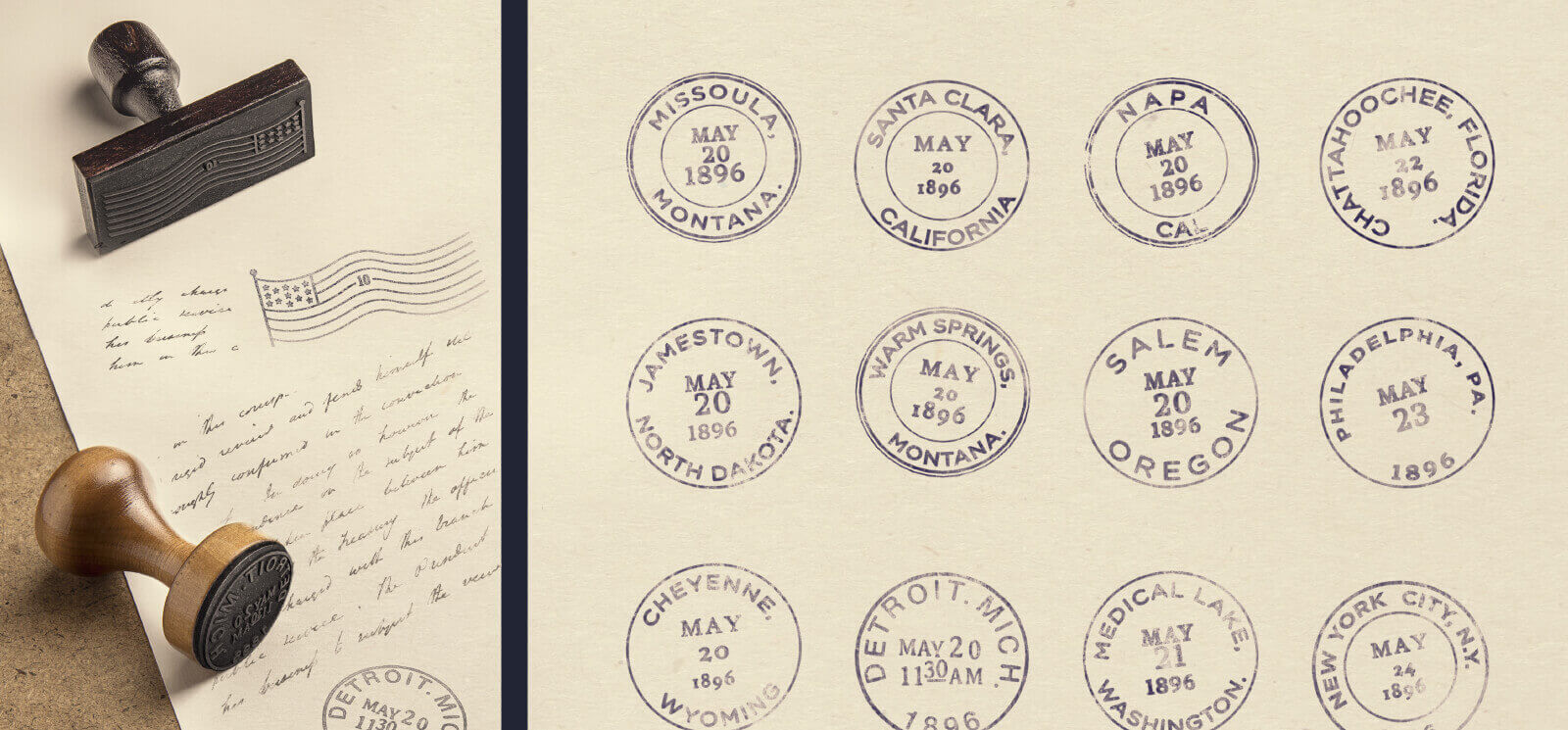
Stamp Sheet – Custom stamp graphics referencing 19th‑century postal aesthetics.
Streetscape Details – Layered signage across shops and offices—capturing the city’s texture, trade, and vertical density.
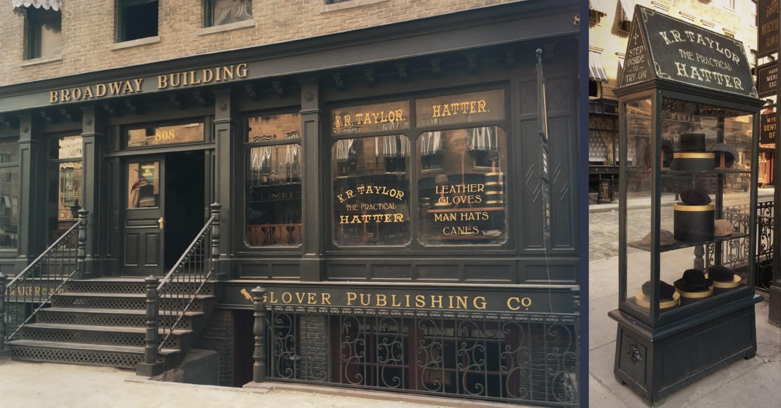
Broadway Building – The show’s central hub—bespoke signage and period details for Sarah Howard’s iconic office facade.
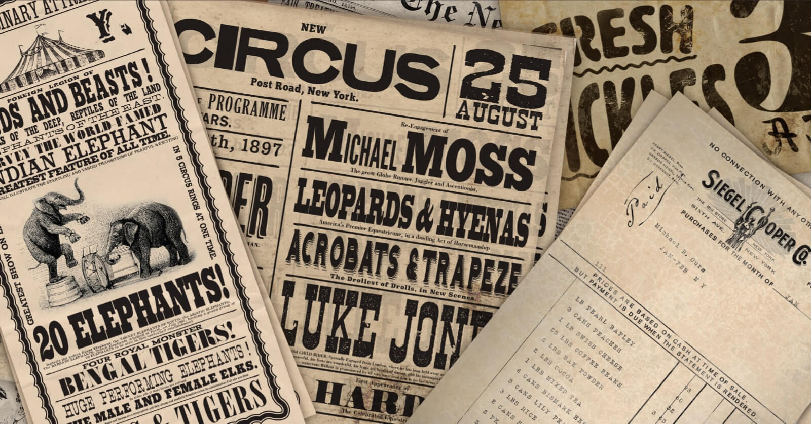
Poster & Flyers Mix – An eclectic set of poster graphics for layered environment dressing.
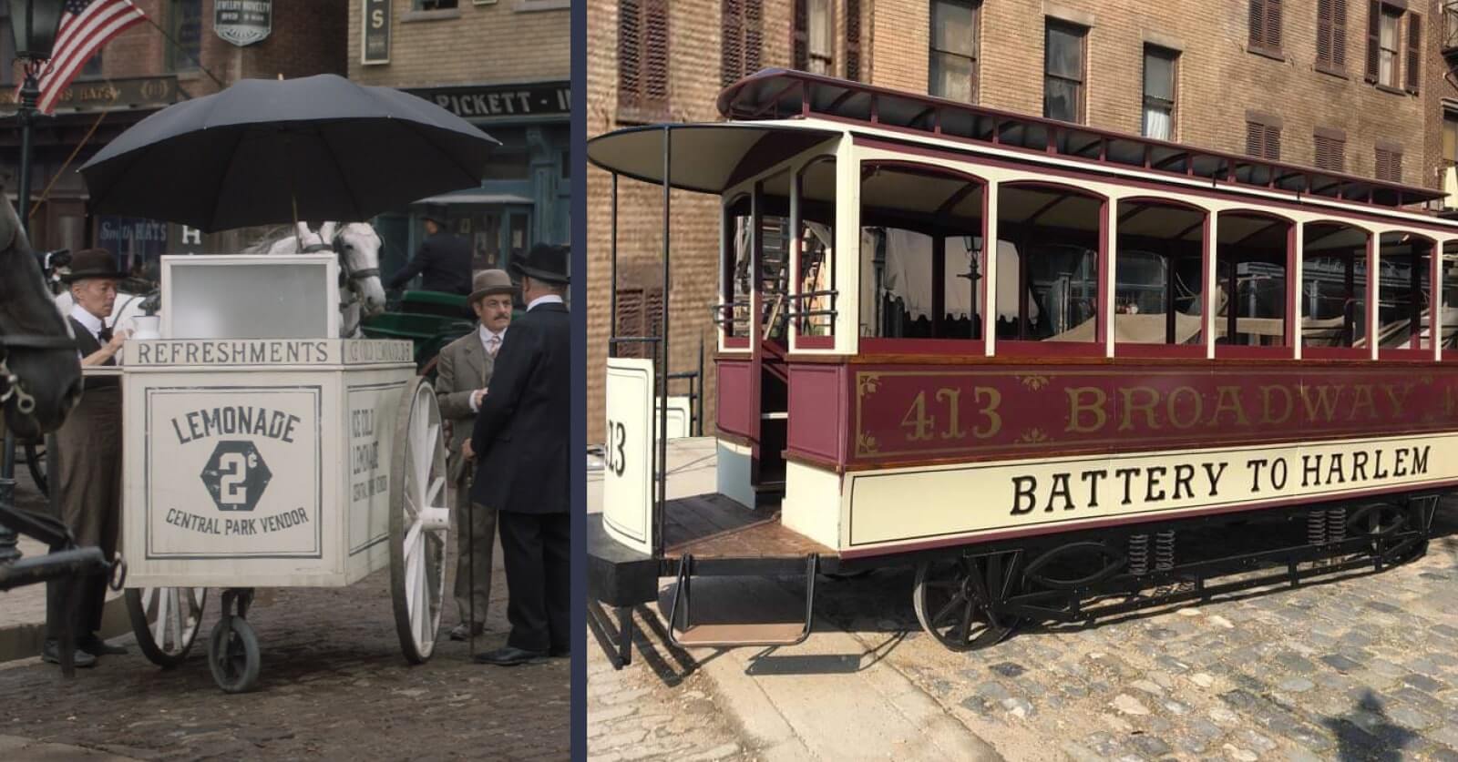
Carriage Branding – Carriage sign design nodding to period transport culture.
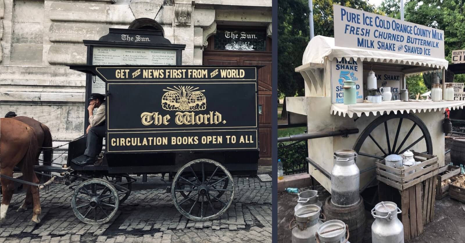
Newspaper & Milk Carts – Rolling ads and vintage vendors—hand-painted signage for street carts straight from 1897.
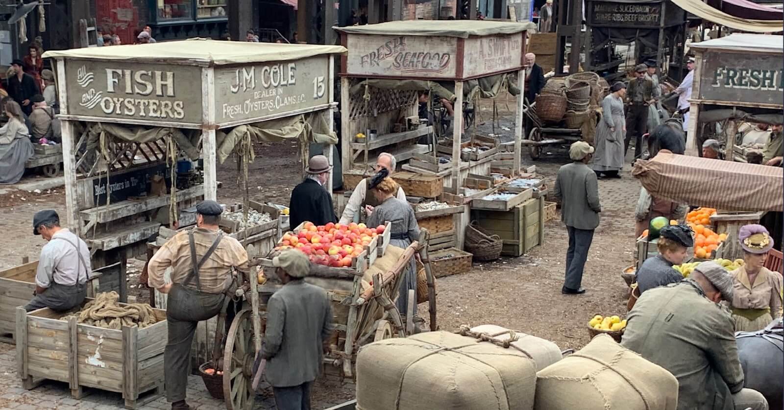
Fish Market Stalls – Hand-painted vendor signs evoking the grit and bustle of a 19th-century street market.
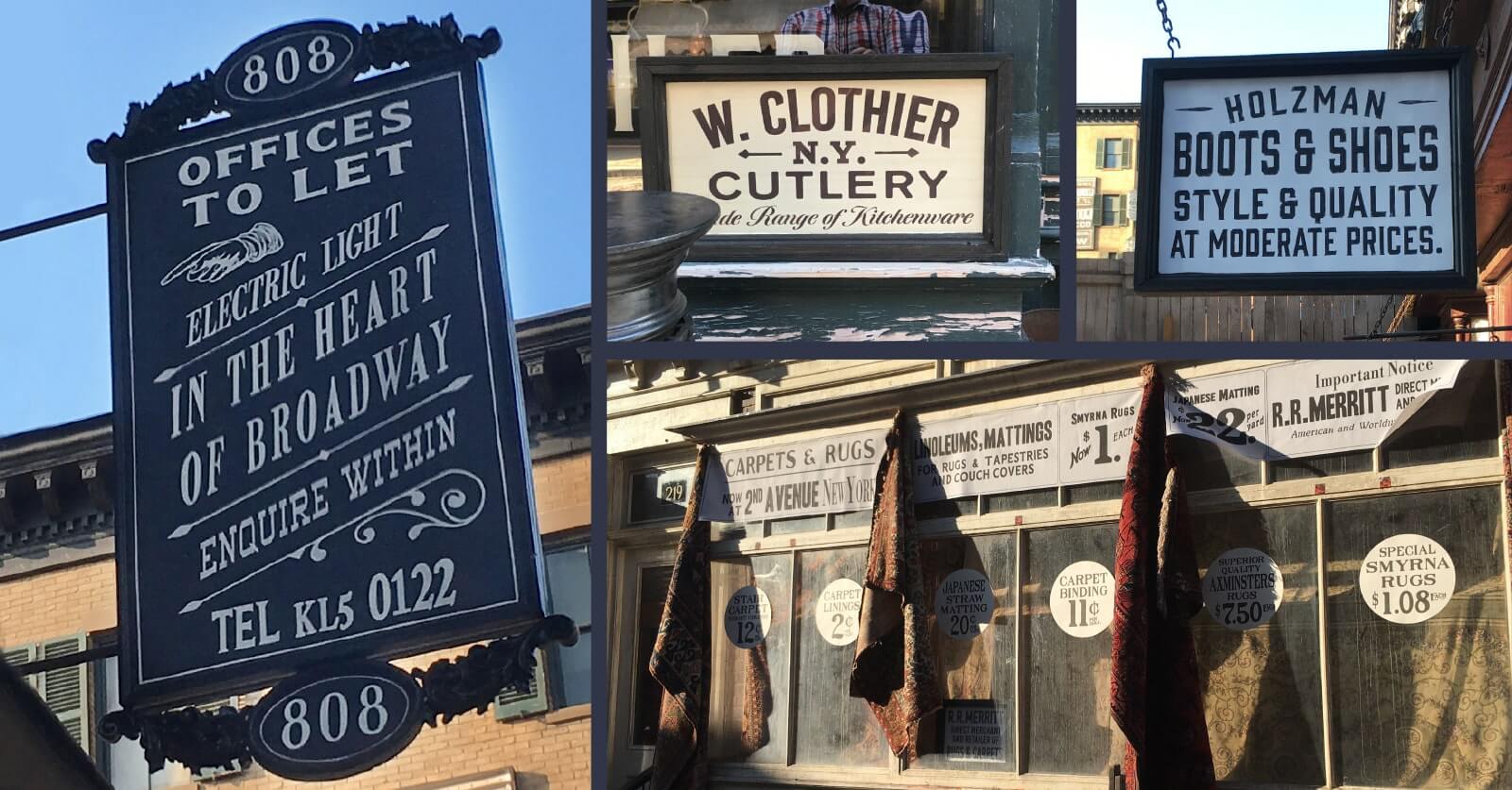
Shopfront Details & Outriggers – Small-scale signage capturing the texture and typography of everyday businesses in period New York.
This project strengthened my ability to merge historical authenticity with screen-ready visuals under pressure — a skill I now bring to all narrative-driven design projects.
We use cookies to ensure that we give you the best experience on our website. If you continue to use this site we will assume that you are happy with it.